Spatial Architects
Services
Brand Strategy
Visual Identity
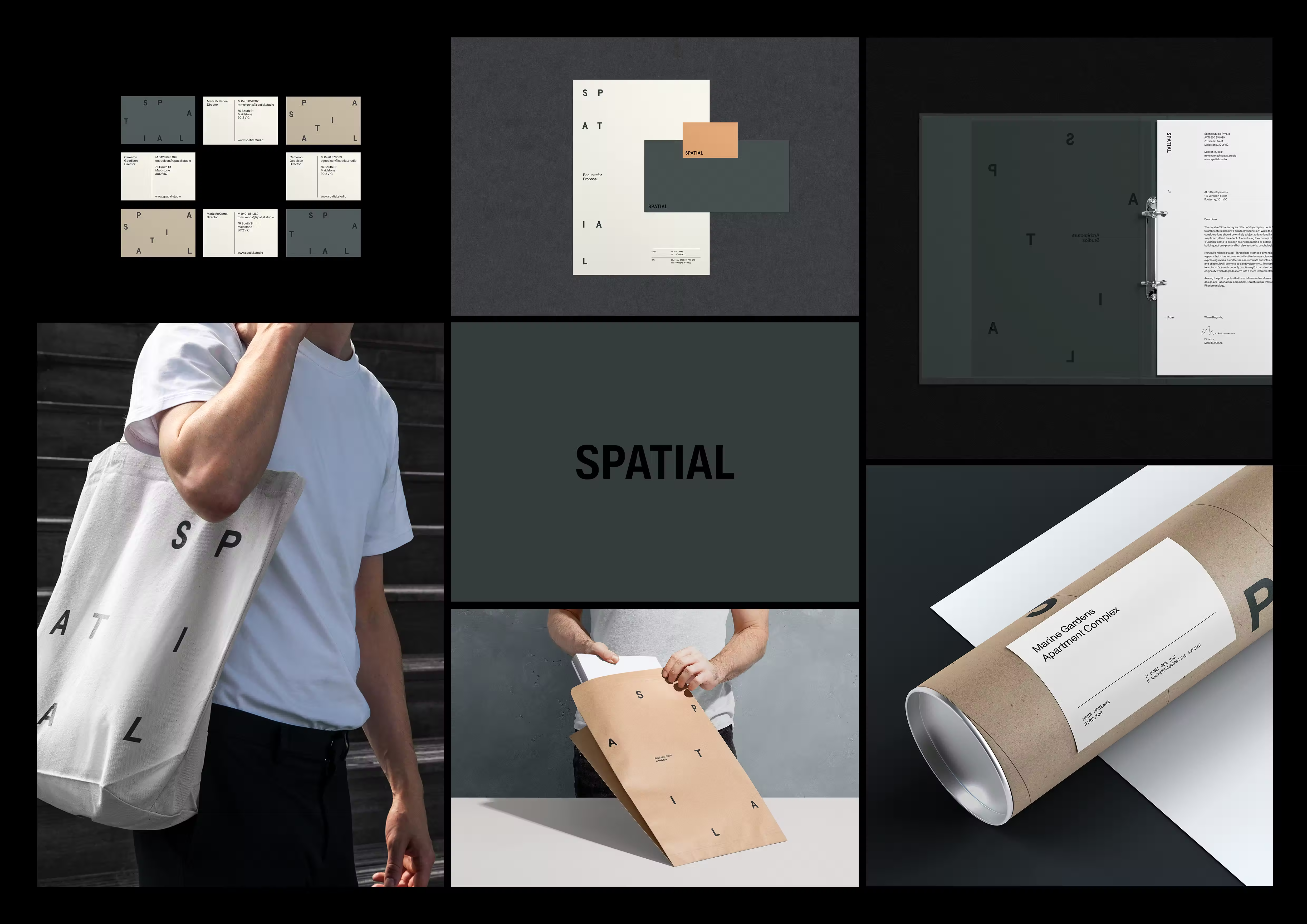
Brand Collateral
In 2021, we partnered with Melbourne architects Mark and Cam to help define the brand for their new practice, Spatial. From the outset, they were clear they wanted to build a studio grounded in their own values and beliefs — one that stood apart from competitors and clearly articulated how they create value for their clients.
As a new practice entering a competitive field, Spatial needed a brand narrative that went beyond creativity alone. The objective was to clarify what the studio would be known for in the future, how it would give clients confidence in complex projects, and how it could clearly demonstrate its value in an industry often filled with uncertainty and risk.
We led the brand strategy and identity design, working closely with the Spatial team to translate their approach to architecture into a clear, credible brand foundation.
Strategy & Visual System
Through a series of workshops, we explored Spatial’s strengths, ambitions, and the realities facing their clients. What emerged was a shared belief that while creativity matters, it is ultimately a means to an end. Clients weren’t seeking originality for its own sake — they were seeking clarity, confidence, and outcomes.
Our research revealed a disconnect between how many architects present themselves and what clients actually value. While architectural practices often foreground creativity and vision, developers and builders consistently spoke about the importance of reducing risk, managing cost, optimising space, and understanding long-term impact. The value of a well-designed built environment is significant, but so are the consequences of getting it wrong.
This insight led to a clear positioning shift for Spatial — away from being seen as purely creative, and toward being recognised as analytical, logical, data-driven, and innovative. We defined Spatial’s role as an evidence-led architecture practice: one that learns from the past, investigates the present, and measures the future impact of its work. Rather than asking clients to trust in their value, Spatial would demonstrate it through data, insight, and early-stage clarity.
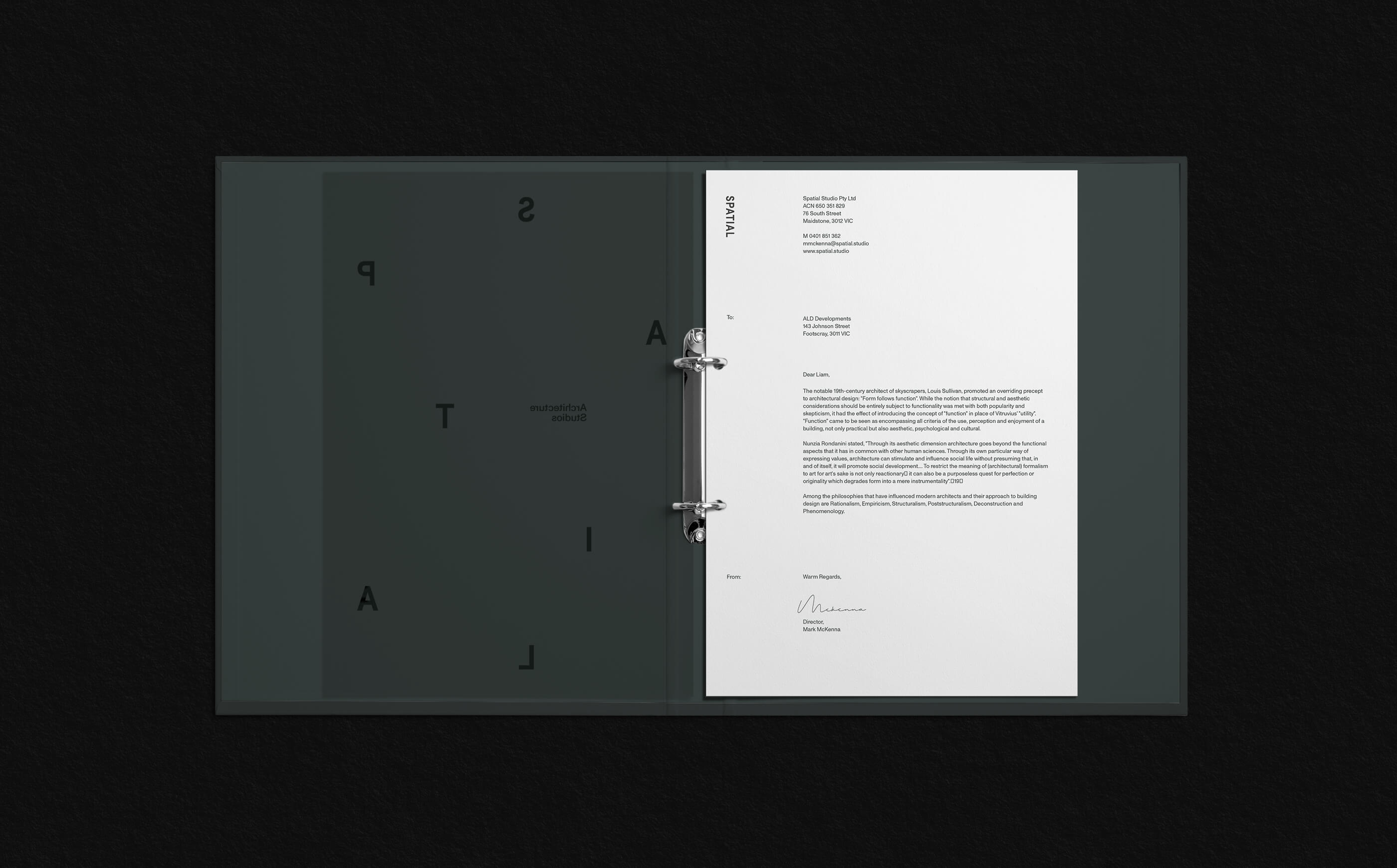
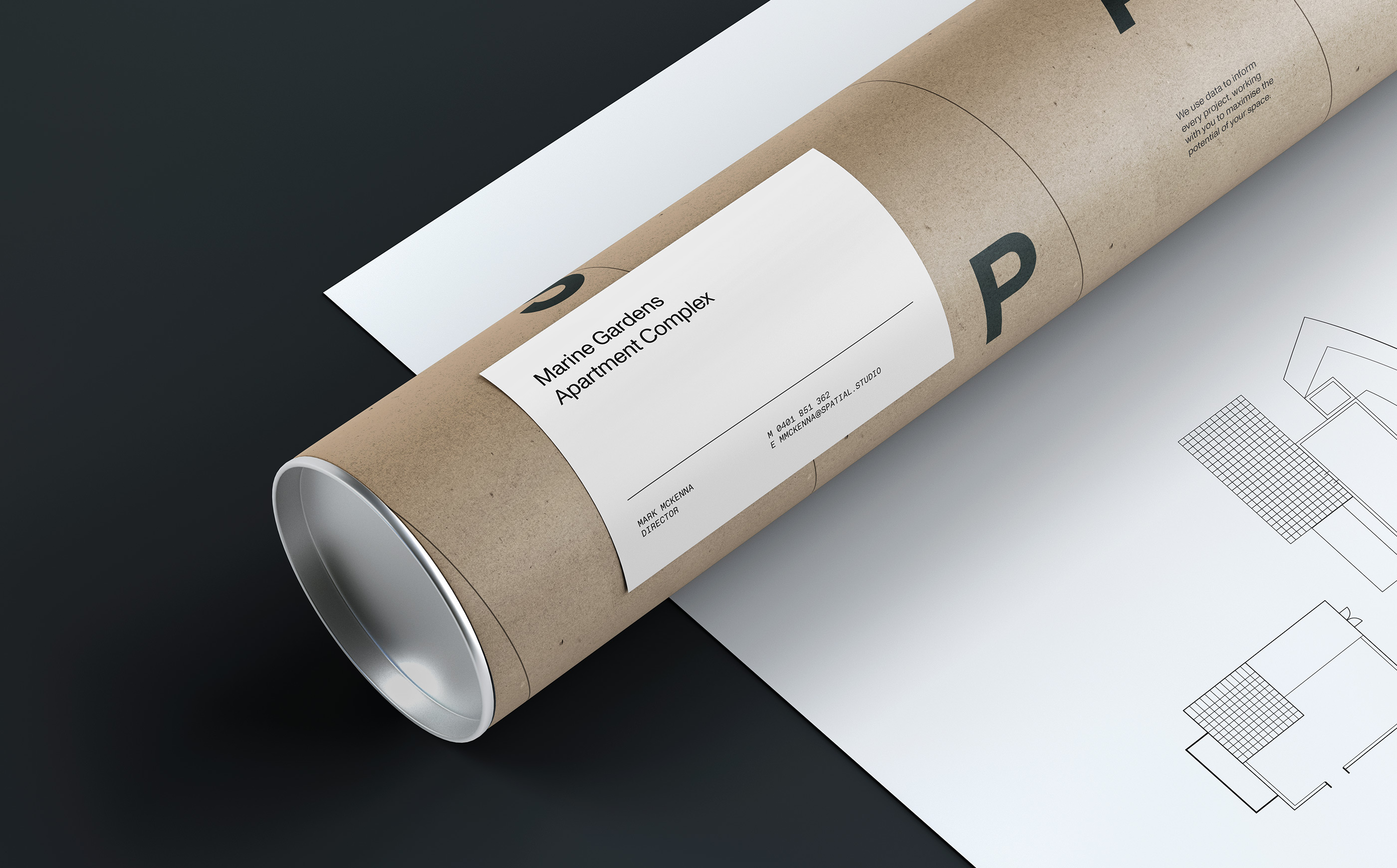
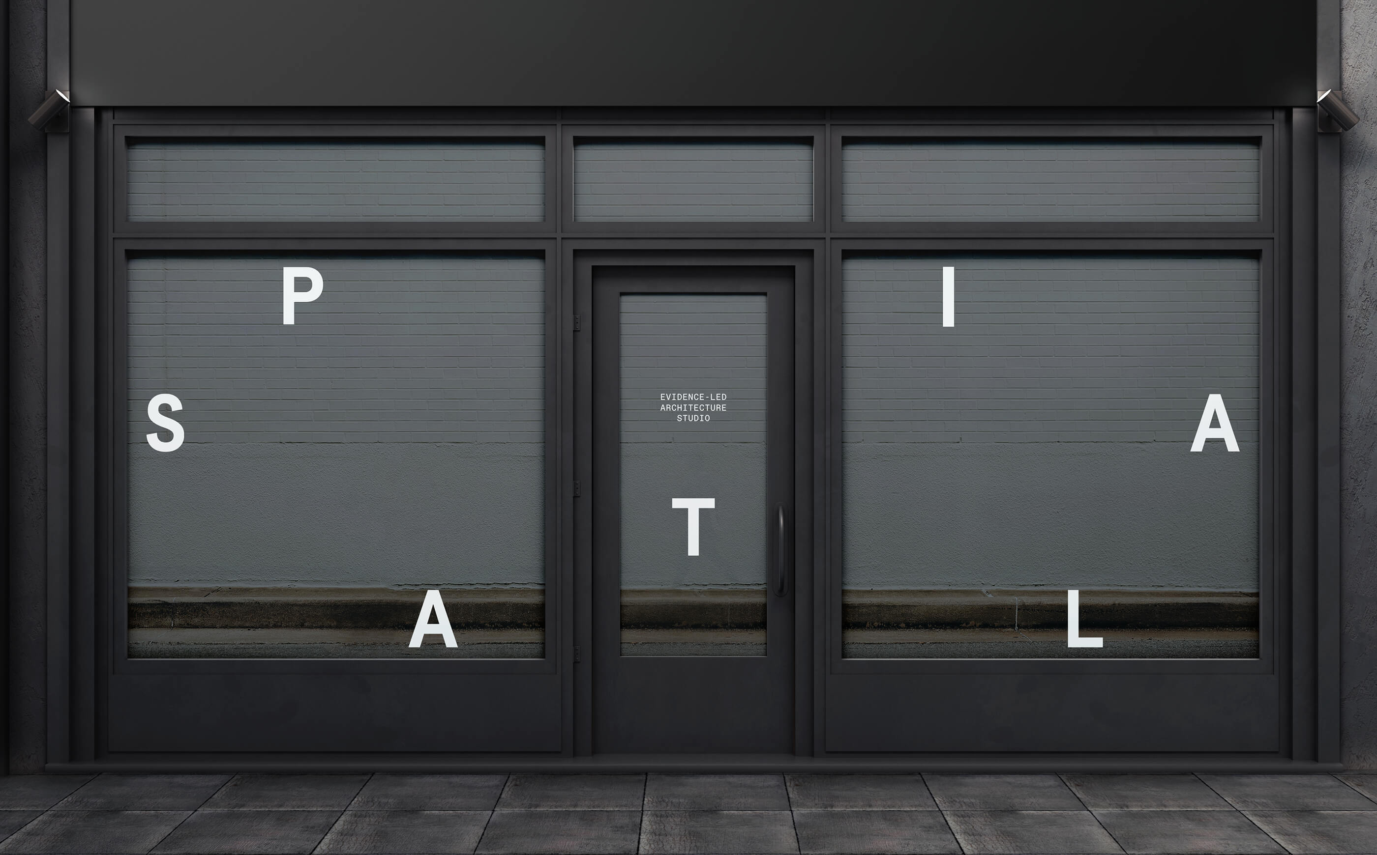
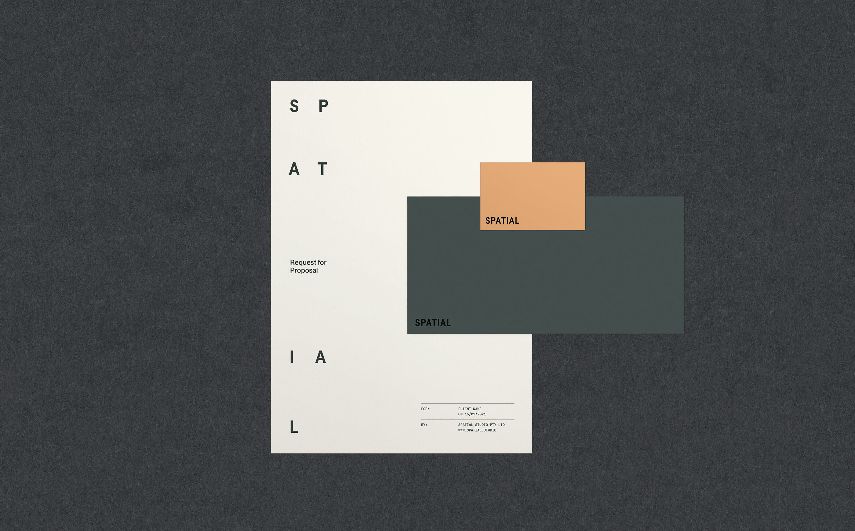
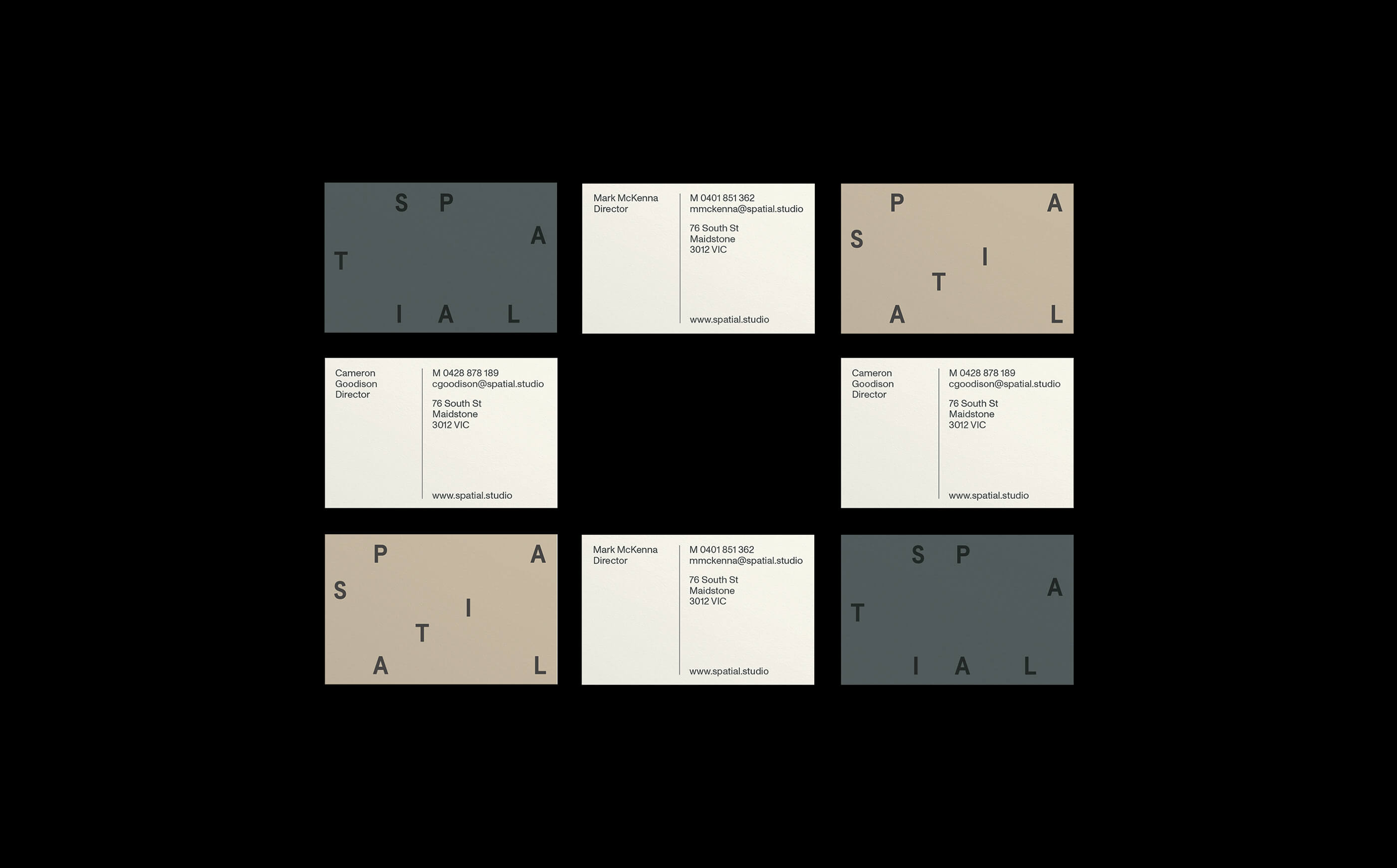
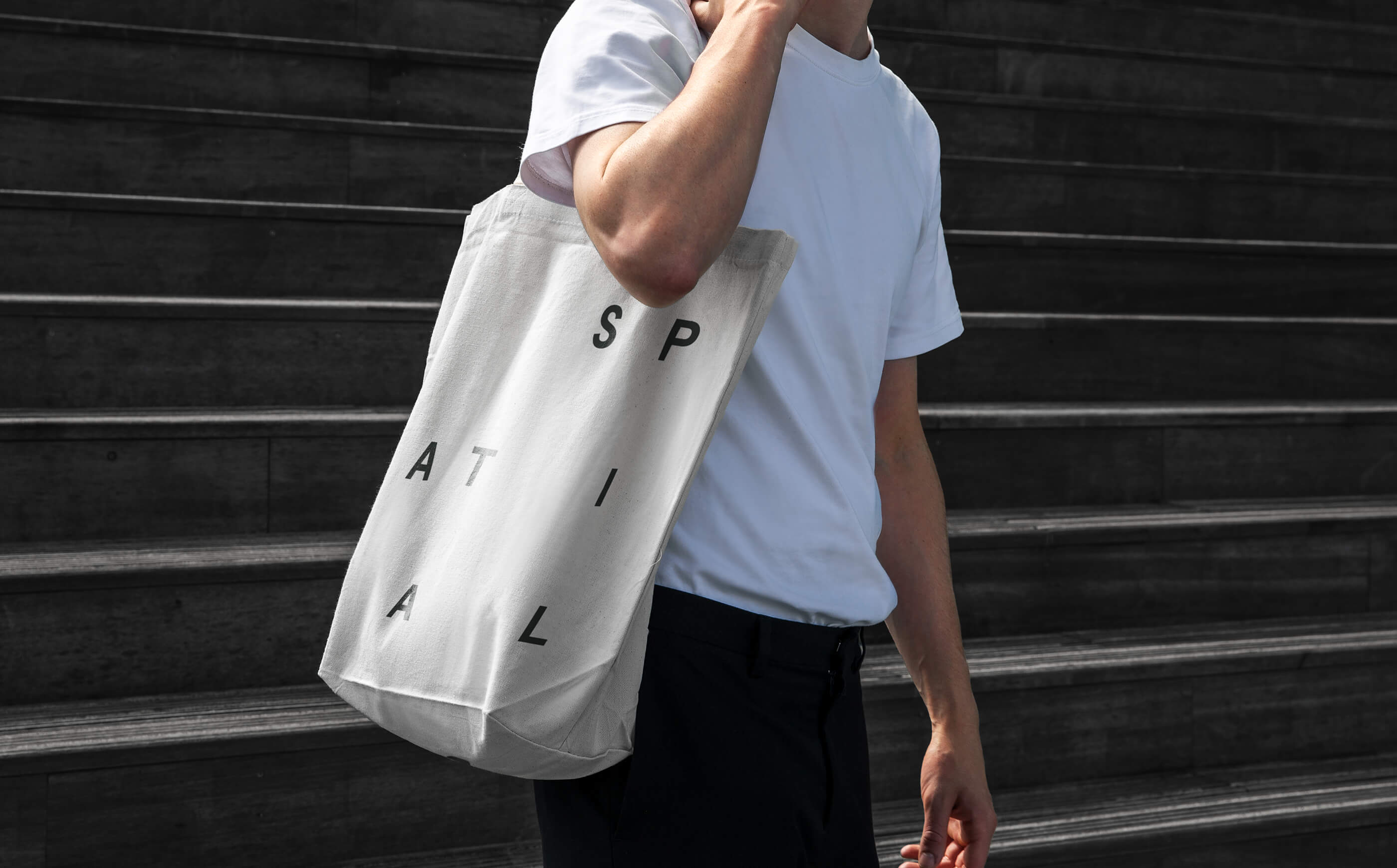
The visual identity was designed to express the idea of optimising space. A structured grid system allows letterforms to be rearranged and composed within defined boundaries, reflecting Spatial’s approach to analysing and maximising the potential of every project.
The logo itself is deliberately pared back, creating room for more expressive layouts and compositions without losing cohesion. Earthy tones and considered typography support the studio’s primary archetype — The Sage — reinforcing a sense of expertise, logic, and calm authority.
The system balances restraint with flexibility. While the identity provides strong structure, it avoids unnecessary embellishment, allowing Spatial’s work and thinking to remain the focus.
Rollout
The identity system was designed to work across studio communications and project touchpoints, providing a consistent framework that could scale as the practice grows. Clear guidelines ensure the system can be applied confidently, while remaining flexible enough to adapt across different contexts.
The result is a brand that feels considered, credible, and aligned with Spatial’s architectural philosophy — supporting the practice’s ambition to be known not just for how its buildings look, but for the value they create.