Ayla

Services
Visual Identity
Visual Language
Art Direction
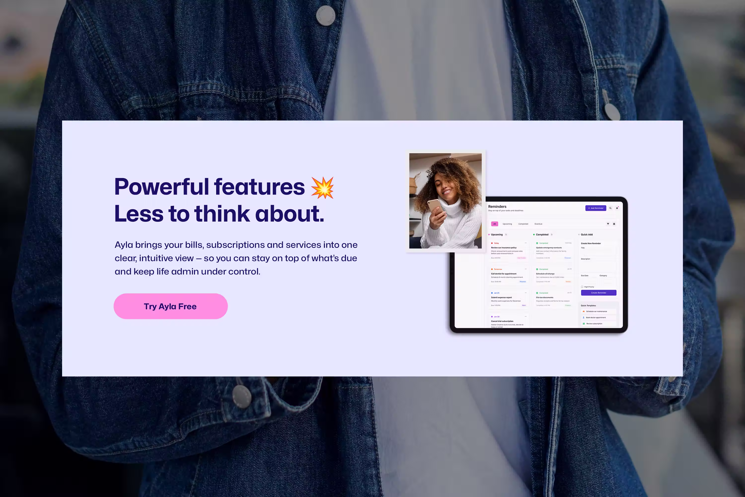
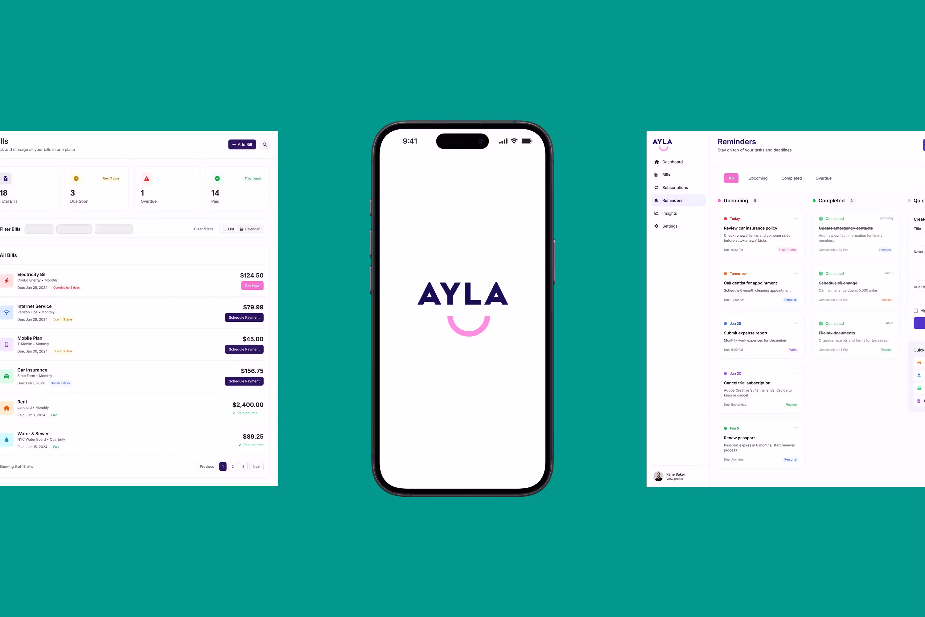
Concept UX/UI
Despite customer loyalty, many Australian households are paying more than they should for essential services. Ayla was created to help people regain control of their financial world — positioned not as another utility app, but as a financially literate friend.
The challenge was to build a brand that felt approachable and human, while still credible in a category dominated by impersonal, transactional products.
I led the brand design and developed concept-level UX/UI explorations, working closely with the Ayla team to translate the product’s positioning into a distinctive and scalable visual system that could be expressed both in brand and early interface ideas.
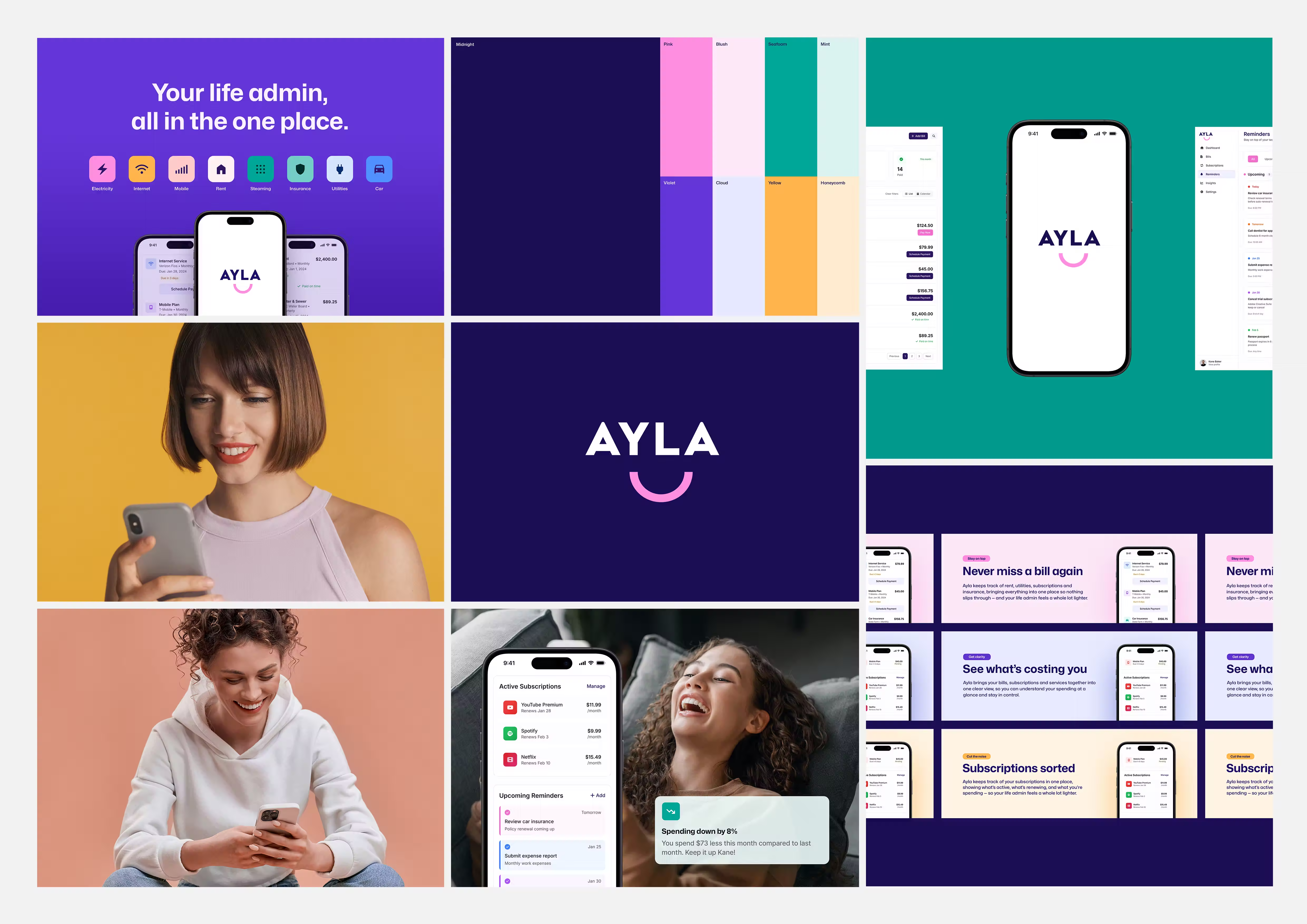
Brand System
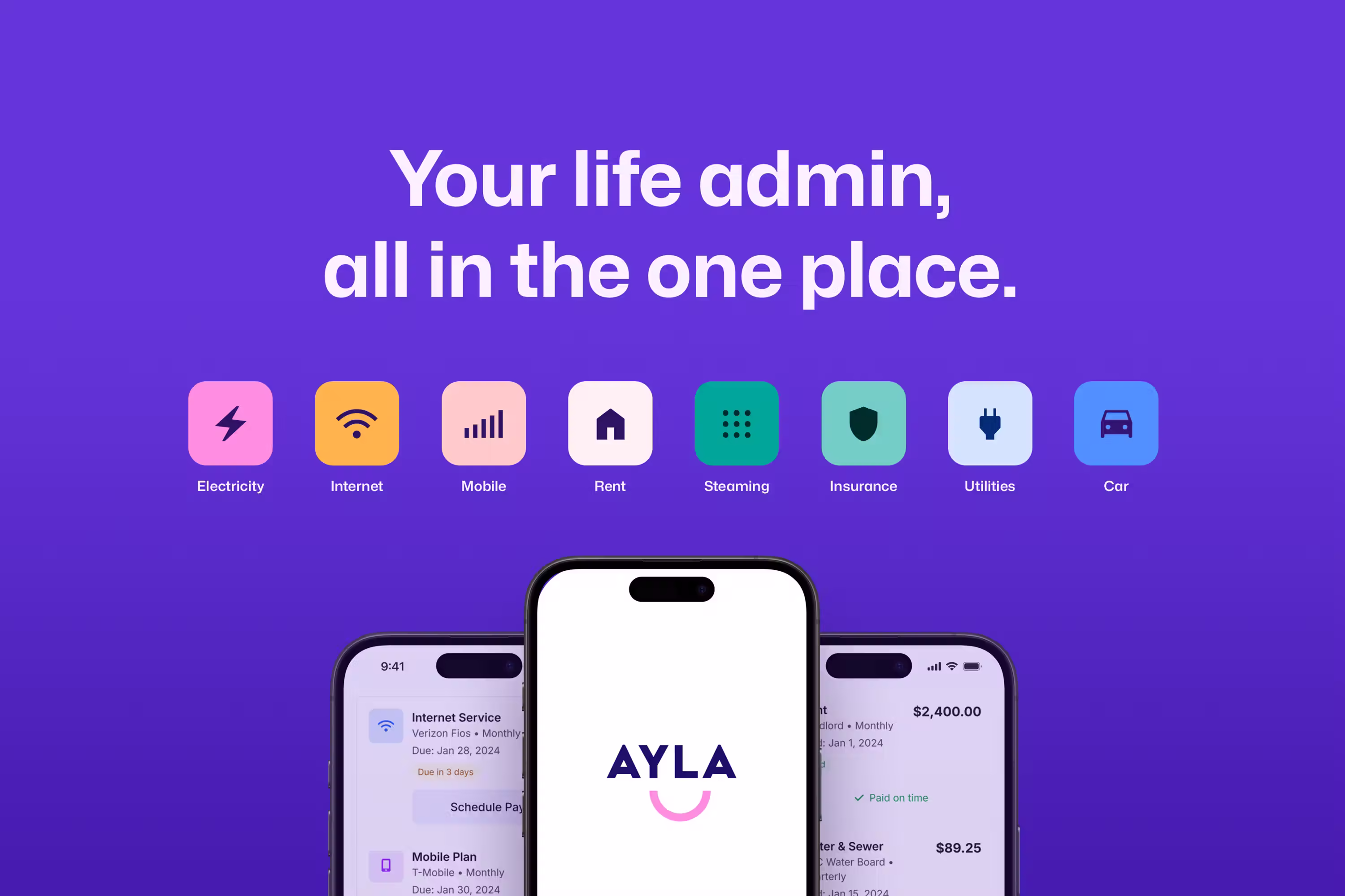
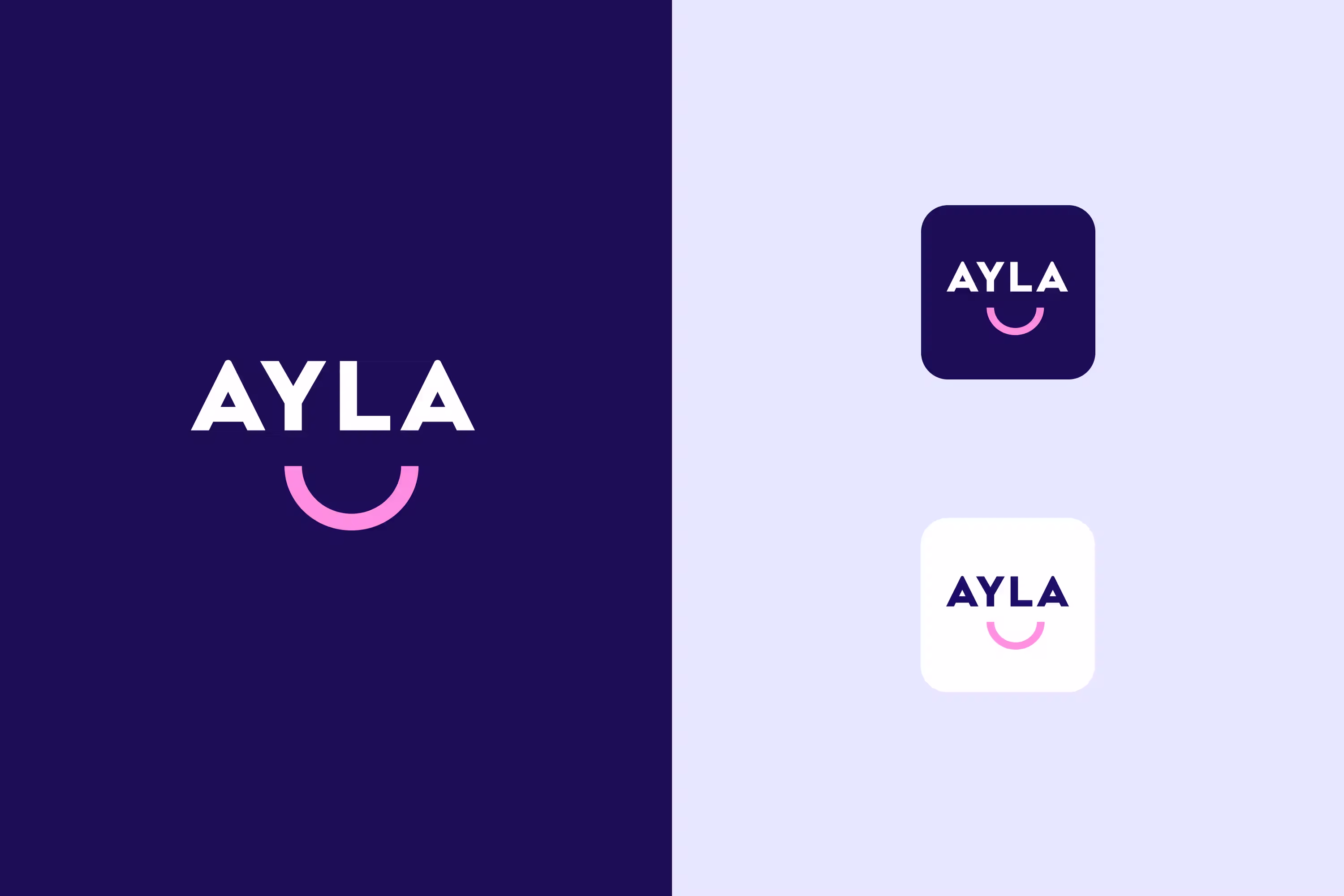
The brand system was designed to give Ayla a clear personality without relying on a literal human character. The logo was developed to feel personable and expressive, acting as a character in its own right.
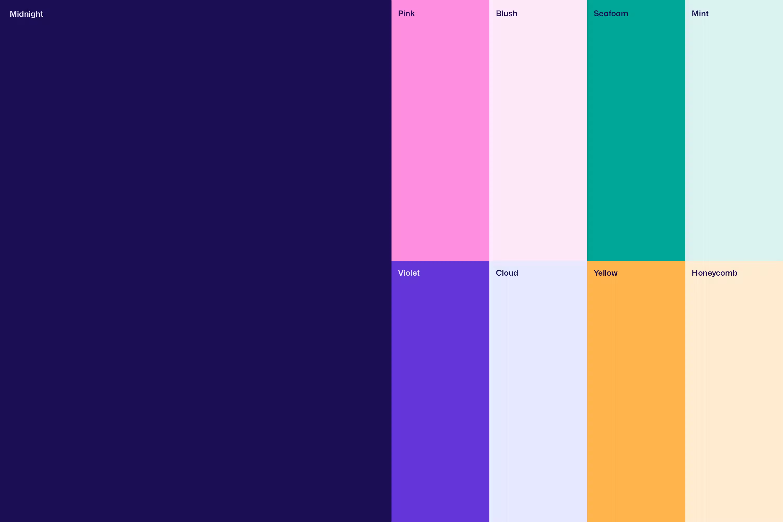
Personality attributes such as playful, fresh, friendly, and cutting-edge guided the visual direction. A bright, bold colour palette and modern humanist typefaces were selected to balance warmth with clarity, supporting trust while maintaining distinctiveness in a crowded fintech landscape.
From the logo, the arc was extracted as a core graphic device. This element became a flexible way to create branded moments across imagery and layouts without over-reliance on the logo itself. Conceptually, the arc represents life with Ayla — clarity, momentum, and the feeling of being back in control.
The result was a distinctive brand system designed to flex across product, marketing, and future growth touchpoints.


Rollout
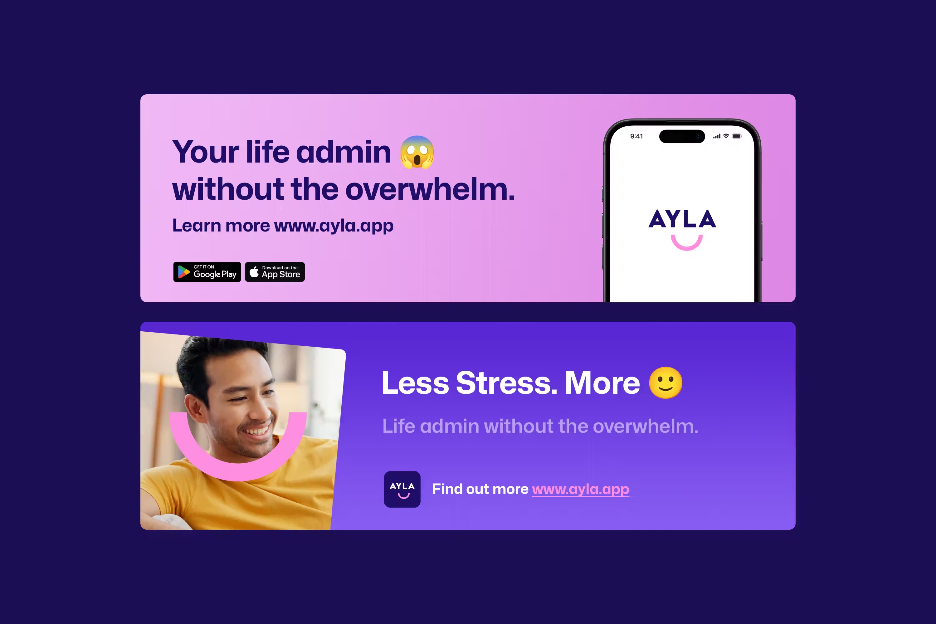
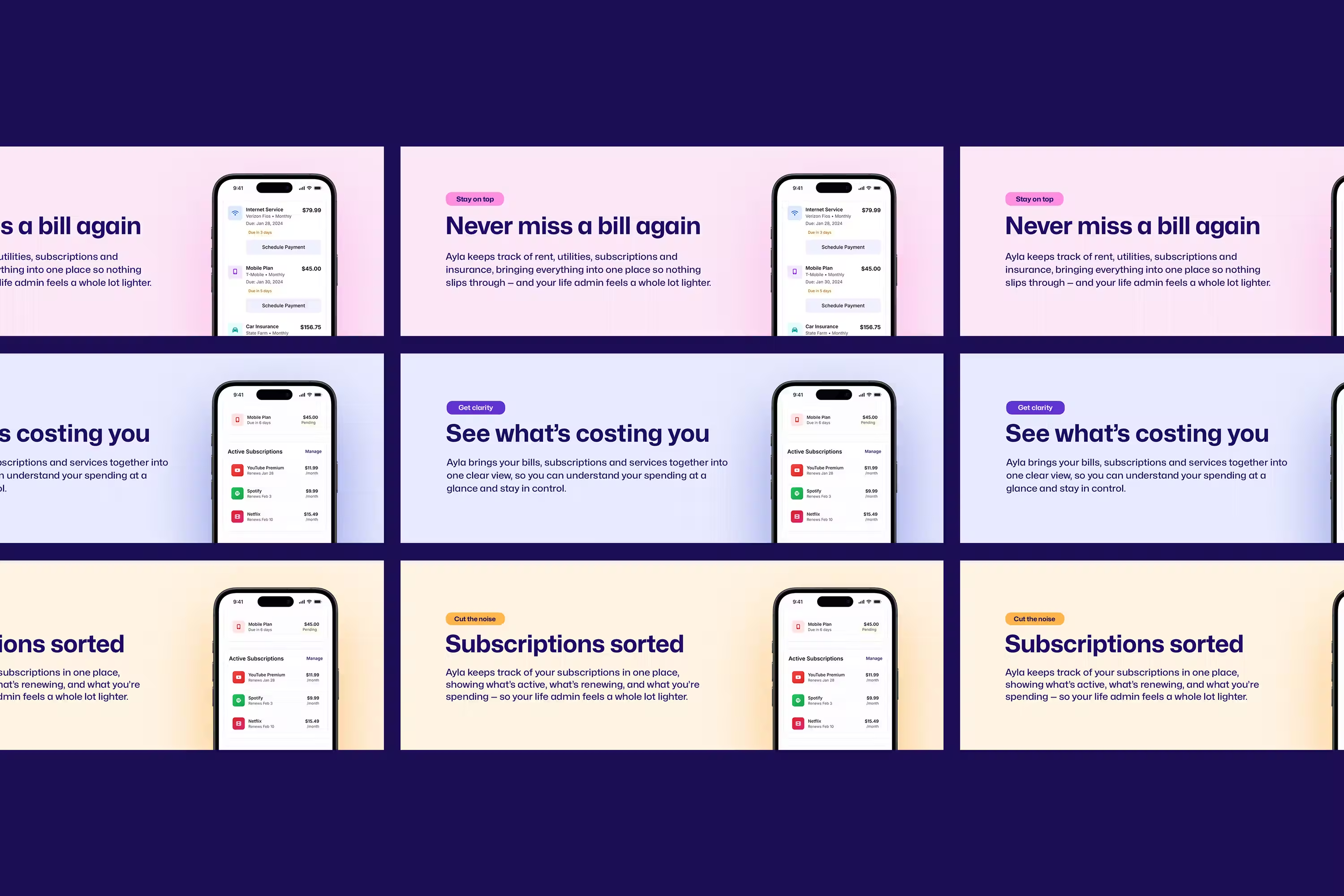
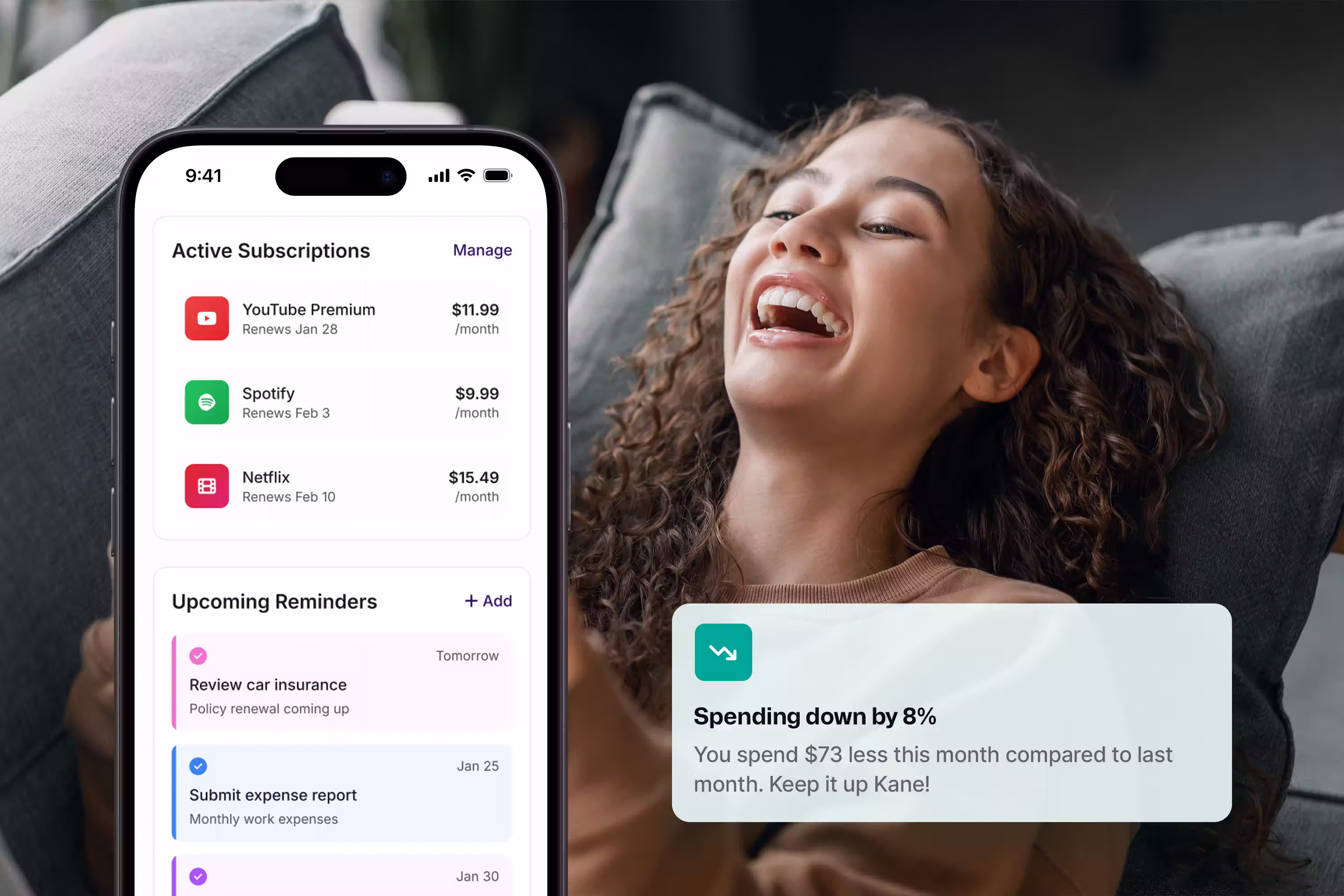
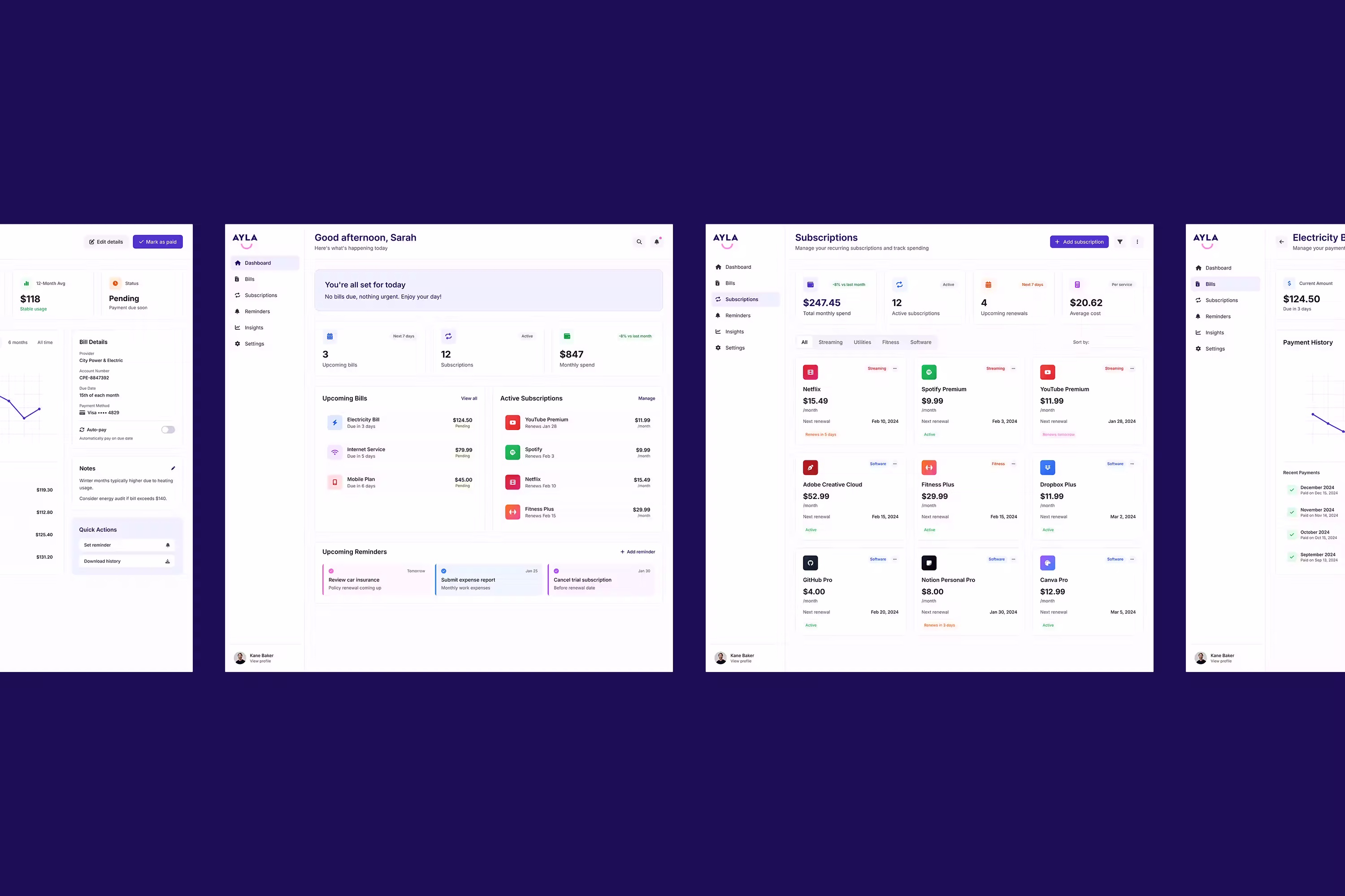
The system was applied across Ayla’s digital and marketing surfaces, ensuring consistency between brand expression and product experience.
Graphic elements, colour, and typography were designed to integrate seamlessly into interface layouts, allowing the brand to enhance usability rather than distract from it. The supporting arc and hand-drawn elements provided moments of personality within structured UI environments, helping the product feel friendly and approachable without compromising clarity.
The identity was delivered as a modular system, giving the team the flexibility to apply the brand consistently across launch materials, in-product messaging, and ongoing communications as the product evolved.